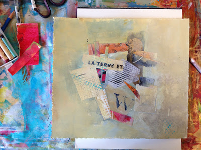
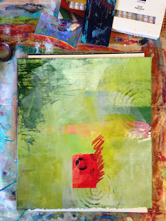
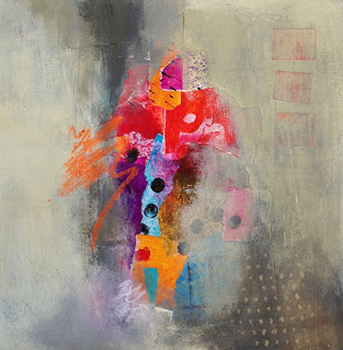
This first piece I had a lot of trouble with. The exercise was in working with complementary colors. I chose green/red and struggled (Image 1). It was hard for me to get good greens and felt like Christmas. The first shot is where I got stuck. I didn't like the composition, the colors and I didn't know where to go from this point. So I put it aside and after Jane's demonstration of using the brayer and her words of wisdom on process and painting over things that just weren't working, I pulled out the brayer, the Green Gold and White paint and went to town; I figured I had nothing to lose at this point (Image 2). Then I went back in with abandon, experimenting with colors, textures and painting over anything that I didn't like (Image 3); et voilà! The best thing is that I learned so much from working on this piece; it really set me free.
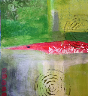 |
| Image 1 |
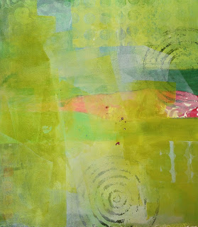 |
| Image 2 |
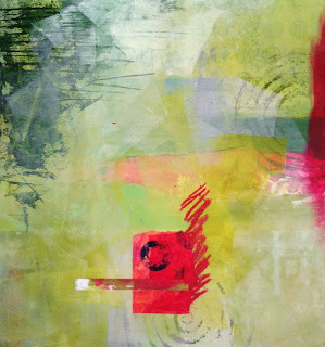 |
| Image 3 |
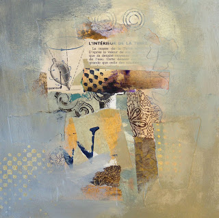
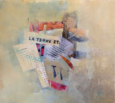
Then I worked on a series of pieces that used neutrals and more muted colors, working again on exercises of opposites: quiet space vs. busy space, soft edges vs. hard edges and high contrast vs. minimal contrast. Here's what I came up with.
I really like these, particularly the color palette, and I have been working in this vein since I returned.
